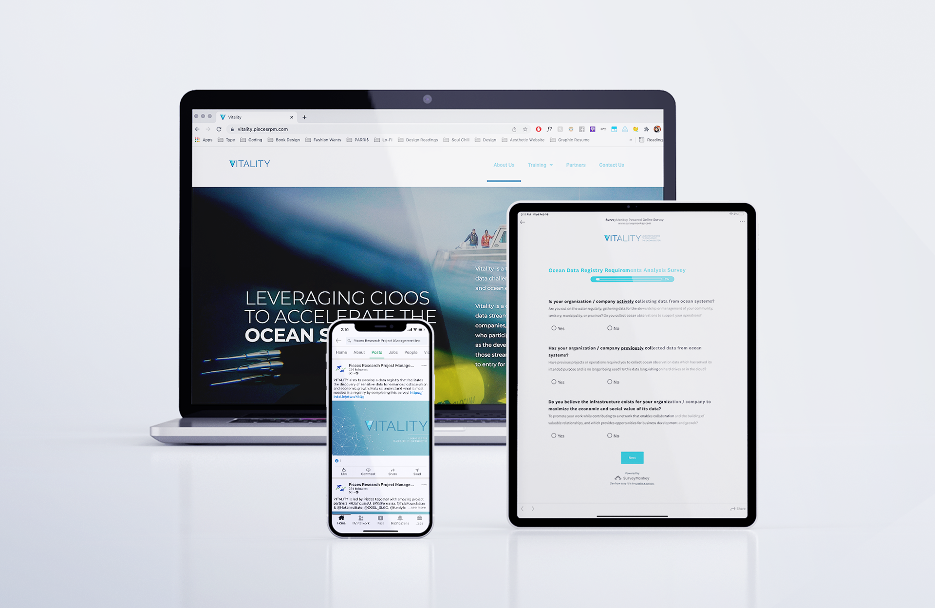
Vitality is a project that connects CIOOS to the needs of the indigenous and private sectors in the Canadian ocean industry.
Branding and Graphic Identity, Communications, Website Design
2020 - 2021
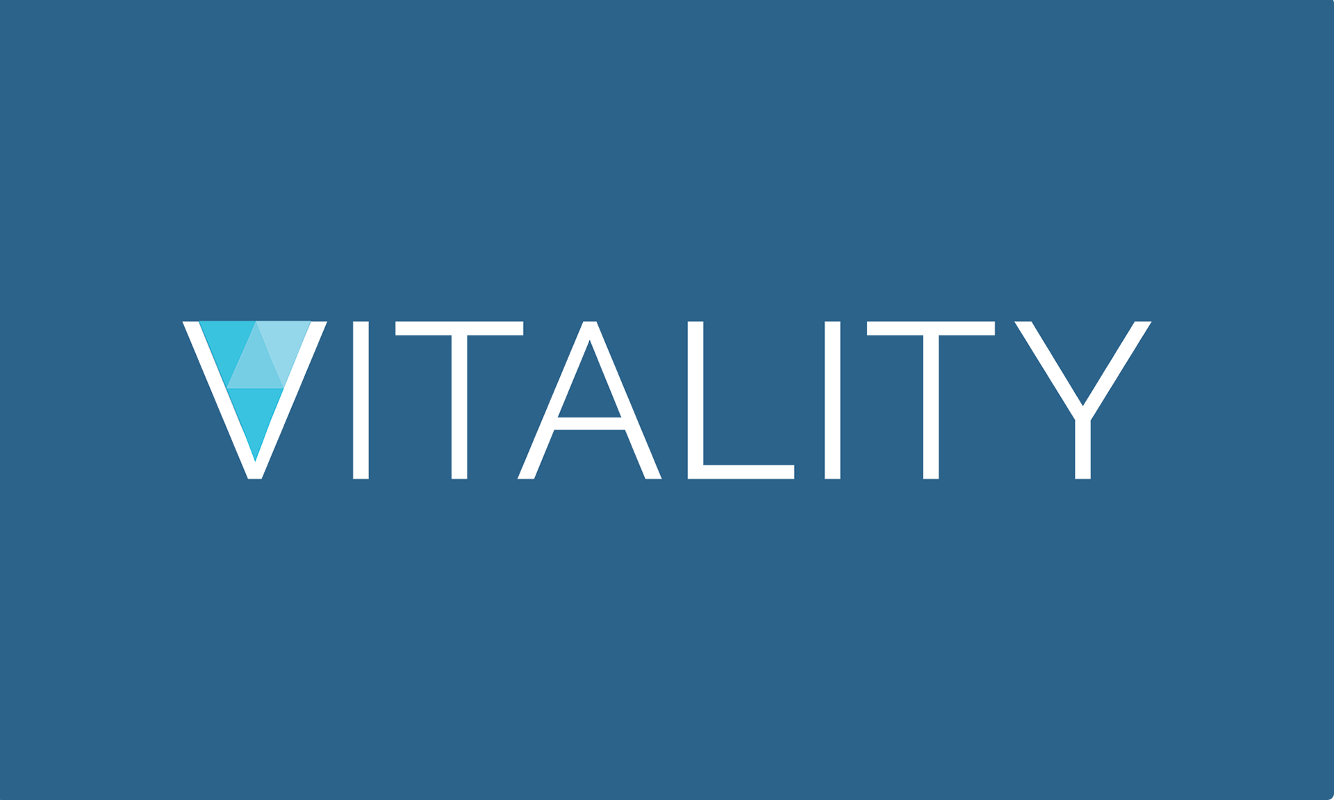
The logo came together based on two over-arching themes, interconnectivity and Geodesic domes. Incorporating these two elements in the logo shows that ocean data sharing between private sectors and Indigenous communities is vital.
Brand Strategy
I developed a brand identity system for the Vitality project intended to last for at least two years. Because this project is an extension of CIOOS, their branding is seen as a great influence for this project.
Ocean Allies brand typography pairs Raleway and Montserrat. Raleway is classified as a neo-grotesque sans-serif font, created in 2010 by Matt McInerney and expanded by designers at The League of Movable Type.
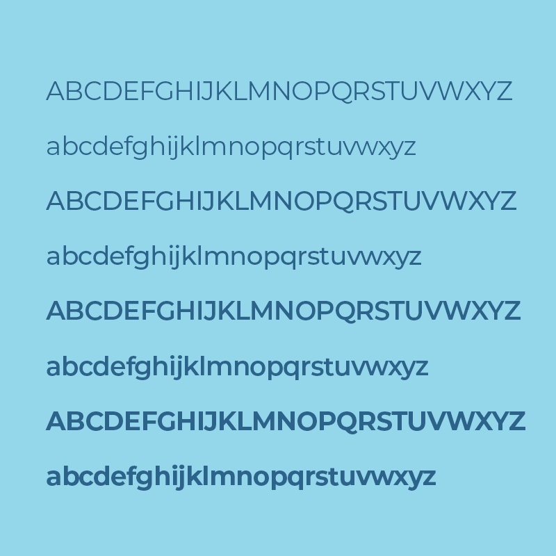
It reflects the structure the ocean sector provides and Roboto is modern, yet approachable and emotional.
Visual Identity
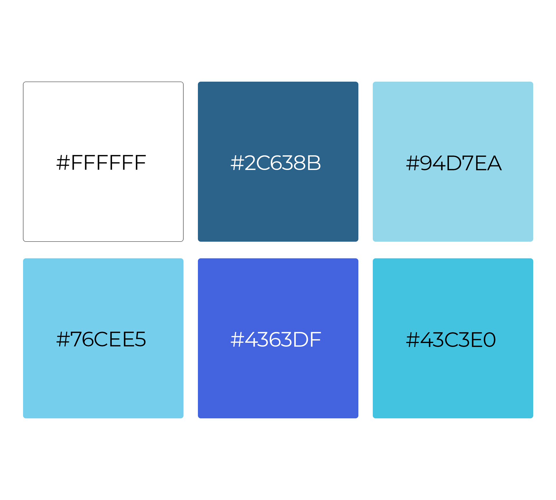
The visual language helps establish a holistic brand that feels professional and academic. Vitality brand is led by simplicity and interconnectivity which invites curiosity.


Brand Support
After the identity is finalized and a new website is underway, theres dozens of other assets to be created: presentation templates, social media banners, post templates, project reports, etc. Through the brand support service, we helped develop these quickly and efficiently.
We utilized icons and illustrations to carry the brand through the website experience. We made sure that the ocean allies website is malleable for changes so we developed it using wordpress and elementor